A torn chart found in an Ottoman palace has been asked to carry an impossible burden. It has been called a copy of an ice-free Antarctica, the residue of a vanished civilization, and proof that sixteenth-century sailors inherited knowledge they could not have acquired. I approached it with a narrower question: if the Piri Reis map is a compilation, can its strangest coastline be explained by the way its sources were joined?
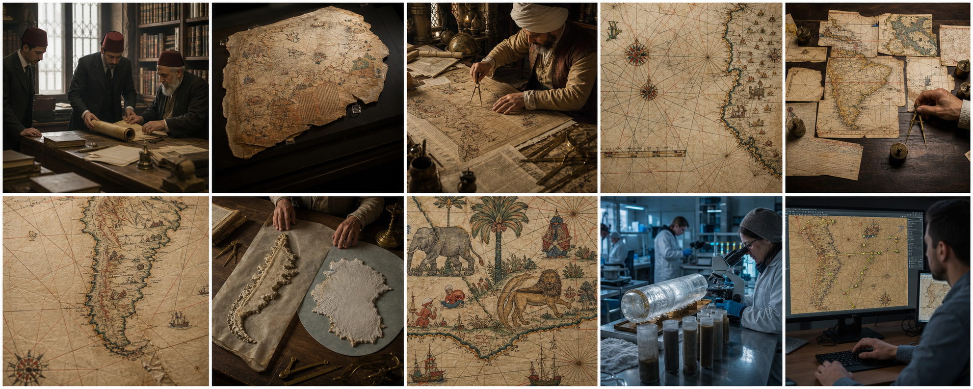
Reconstruction: archivists working among the Topkapı collections in 1929. The dramatic object entered modern debate through an ordinary act of cataloguing.
The discovery before the legend
In 1929, during the reorganization of the Topkapı Palace collections in Istanbul, scholars encountered a painted parchment chart signed by the Ottoman navigator and cartographer Piri Reis. The date written on it corresponds to 1513. What survived was not a complete world map. It was a fragment showing the eastern Atlantic, the western coasts of Europe and Africa, and portions of the Americas. That limited object is the one we must investigate. Every argument that silently imagines an intact global map begins by adding evidence that is no longer present.
The timing matters. Columbus had reached the Caribbean only twenty-one years before the map's stated date. Portuguese voyages had been extending charted coastlines around Africa and along Brazil. Information moved through ports as captured charts, pilots' recollections, copied coastlines, court reports, and commercial secrets. A chart that combines several of those streams is not suspicious by itself. It is exactly the sort of object the early sixteenth-century Atlantic could produce.
The map is now held by the Topkapı Palace Museum and was inscribed on UNESCO's Memory of the World Register in 2017. UNESCO describes it as a portolan-style world map and emphasizes its exceptional value as an early record of the newly encountered Atlantic lands and of information associated with Columbus's voyages. That description is less sensational than the Antarctica story, but historically it is far more remarkable: a document made in the Ottoman world preserves traces of European Atlantic charts that have otherwise disappeared.
The surviving fragment, imagined under conservation light. Its missing portions are a warning: the map cannot answer questions about areas that the fragment does not preserve.
A map that tells us it was assembled
The most useful clue is not hidden. Piri Reis says, in the map's own notes, that he compiled his work from multiple earlier charts. Translations differ in detail, but the inventory is commonly summarized as about twenty source maps, including older mappae mundi, charts connected with the Portuguese voyages, an Arabic map of India, and a map associated with Columbus. We should not treat “twenty” as twenty sheets of identical age, projection, accuracy, or purpose. The phrase describes a mixed archive.
That changes the problem. A modern map normally begins with a single coordinate system. A compiler in 1513 could instead have coastlines copied at different scales, with uncertain longitudes, from charts whose makers had measured distance by dead reckoning and latitude by observations of uneven quality. He then had to fit those pieces onto one animal skin. The finished surface could look coherent while preserving local seams.
Piri Reis was not an armchair mystic. He was a mariner whose later Kitab-ı Bahriyye became a richly detailed guide to Mediterranean coasts, harbors, islands, hazards, and sailing conditions. His cartographic habits belonged to navigation: shores, ports, rocks, shoals, winds, and routes. The Turkish Historical Society's explanatory material notes conventions in which inhabited places and fortifications, uninhabited places, reefs, shallows, and hidden rocks were distinguished by color or symbol. Such signs are practical marks. They tell us to read the parchment as a working maritime picture, not as a modern political atlas.
A plausible 1513 workshop: dividers transfer distances while several inherited charts compete for space on one parchment.
The mechanics of a portolan chart
The map's web of radiating lines belongs to the portolan tradition. These rhumb-line networks helped mariners follow compass directions between points. They are not lines of latitude and longitude in the modern gridded sense, and they do not imply an aerial survey. A compass rose can look technologically sophisticated while the outline beneath it still contains accumulated estimates, copying errors, and deliberate compression.
Imagine copying a coastline with dividers. If one source places two capes farther apart than another, the compiler must choose which interval to preserve. If the receiving parchment is already crowded, a coast may be rotated or bent. If the source lacks a firm longitude, the copied segment can slide east or west without appearing locally wrong. Each decision is modest. Several decisions together can create a spectacular global distortion.
Early Atlantic charts also had different evidentiary densities. The well-sailed coasts of Iberia and West Africa could draw on generations of pilot knowledge. Newly reported Caribbean islands might be misplaced, repeated, or enlarged. South America's coast was only partly known to Europeans when Piri Reis worked. The farther the map moves from frequently navigated waters, the more dangerous it becomes to assume that every painted contour represents a surveyed shore.
Rhumb lines organize direction, not modern satellite accuracy. Their geometry can make a chart look more exact than its coastal measurements were.
I treated the parchment as a forensic collage
My reconstruction began by separating four source families instead of tracing one continuous “world coast.” The first is the familiar northeastern Atlantic: Iberia and northwestern Africa. The second is the West African coast extended south by Portuguese navigation. The third is the Caribbean and adjacent lands, where information connected with Columbian voyages appears. The fourth is the Atlantic coast of South America, whose proportions and orientation change as it runs toward the bottom of the surviving fragment.
Next I asked where a compiler would feel pressure. The Caribbean contains islands whose sizes and placements are difficult to reconcile with a single measured projection. Brazil occupies a large visual role. The lower coast approaches the physical edge of the skin. These are not random defects; they are exactly the locations where incompatible source charts and limited parchment would collide.
Gregory C. McIntosh's book-length analysis follows this documentary route. It studies the inscriptions, place names, iconography, and likely source relationships rather than extracting a single outline from its context. The result connects portions of the map with exploration-era material, including information that fits Columbus's early voyages, while rejecting the claim that it requires an advanced prehistoric survey or extraterrestrial source. The map becomes more intelligible when treated as a sixteenth-century compilation—and more interesting, because its oddities preserve the act of compilation.
Source-chart montage: different scales and uncertain longitudes produce seams even when every individual copy is made carefully.
The coastline at the center of the dispute
The famous claim concerns the land that continues from South America across the lower part of the map. To some twentieth-century readers it looked like Antarctica, especially the coast of Queen Maud Land, shown without its ice. Charles Hapgood gave the idea broad circulation in his 1966 book Maps of the Ancient Sea Kings. Later retellings often shortened a chain of speculation into a statement of fact: “Piri Reis mapped Antarctica before it was discovered.”
The first difficulty is attachment. On the parchment the southern feature does not appear as a clearly separate polar continent across an ocean. It continues from the South American coastline. To call it Antarctica, the interpreter must detach it mentally, rotate or rescale it, and choose modern points that seem to correspond. Those operations may be useful as a hypothesis, but each introduces freedom. With enough flexible matching, coastlines that were never related can be made to resemble one another.
The second difficulty is what disappears. If the line truly leaps from South America to Antarctica, it gives no convincing account of the southern tip of South America or of the water separating the continents. Defenders sometimes argue that the map predates European knowledge of the Strait of Magellan. That is possible as a historical observation, but it does not turn a continuous line into a surveyed Antarctic shore. Ignorance of a strait is a direct reason why a compiler might continue the mainland eastward.
The third difficulty is descriptive context. The map's southern region is decorated and annotated in the vocabulary of inhabited or navigable geography, with animals and reports derived from voyage literature. Its world is not an ice-covered polar coast. Iconography is not a thermometer, but it tells us what kind of place the cartographer believed he was depicting. A warm or temperate extension of the known southern lands fits that visual language better than Antarctica.
The crucial contour bends east at the bottom of the fragment. The question is whether this is a newly surveyed continent or a compressed continuation of South America.
Three explanations placed under the same test
| Hypothesis | What it predicts | What the map actually gives us |
|---|---|---|
| An ice-free Antarctic coast | A distinct polar land with geographic correspondences strong enough to survive objective alignment, plus a credible route by which ancient survey data reached 1513. | A coastline attached to South America, loose visual matches requiring rotation and stretching, warm-climate imagery, and no documented chain of custody for a prehistoric survey. |
| A conventional southern continent | A speculative southern land added because inherited geography expected land in the south. | Possible influence, especially in the general expectation of southern land, but the contour is integrated with the newly charted American coast rather than presented as a clean theoretical circle. |
| A distorted South American continuation | Increasing error toward less-charted latitudes, compression near the parchment edge, and seams caused by different source scales. | All three conditions are visible or historically plausible. The explanation requires no unknown surveying civilization. |
The third hypothesis explains the greatest number of clues with the fewest unsupported steps. It does not claim that every bay can be identified. In fact, that restraint is part of its strength. A distorted coastline should not yield a perfect one-to-one match. The hypothesis only needs to explain why a compiler with incomplete southern data would produce an attached coast that turns east.
A responsible comparison keeps the models separate. Resemblance becomes evidence only after scale, rotation, control points, and expected error are fixed in advance.
The geological clock is not a minor objection
The “ice-free Antarctica” story also encounters physical evidence independent of cartography. Antarctic sediments, landforms, and ice cores record a continent shaped by long-lived glaciation. The U.S. Geological Survey notes that parts of Antarctica may have had continuous glacier cover for roughly twenty million years. That does not mean every meter of every coastline has remained unchanged, but it makes a late prehistoric, civilization-scale survey of a broadly ice-free Antarctic shore an extraordinary proposition.
An extraordinary proposition can still be tested. It would need a date for the alleged survey, a physical condition of the coast consistent with that date, surveying instruments capable of the measurement, a transmission route across millennia, and identifiable copying stages leading to Piri Reis. None of those links is supplied by the parchment. The argument begins and ends with shape resemblance.
This is where chronology protects the investigation from seduction. A coastline match cannot overrule a geological history simply because the image is exciting. It must first survive a blind geometric test, then coexist with the independent date constraints. When the match is flexible and the chronology is unsupported, the responsible verdict is not “impossible map.” It is “overfit comparison.”
Animals and decorative scenes are not literal survey data, yet they reveal the environmental story being told. It is not the story of a frozen polar margin.
Why the myth feels convincing
The claim succeeds rhetorically because it uses a real object, a real date, and a real visual surprise. The parchment looks old enough to promise lost knowledge. Its damaged edges invite us to imagine what is absent. The rhumb lines resemble a technical grid. A modern outline can be placed nearby until portions appear to agree. Each ingredient is authentic; the conclusion emerges from how they are combined.
There is also an asymmetry in the comparison. Matching capes receive attention, while missing straits, wrong orientations, and unmatched stretches are discounted as “projection error.” A hypothesis allowed to explain agreement through accuracy and disagreement through distortion cannot fail. It is therefore not a test.
I tried the opposite rule: choose the transformation before examining individual bays. Use a limited set of control points from securely identified parts of the Atlantic. Apply one consistent transformation, not a new rotation for each feature. Then measure the residual errors over the entire disputed coast. This method does not produce the dramatic Antarctic fit promoted in popular diagrams. It reveals a chart whose local segments were copied with varying reliability and then forced into a single composition.
Ice cores and marine sediments provide an independent timeline. Any ancient-survey claim must fit that physical record, not merely a modern outline.
What could still be learned from the original
Rejecting the polar claim does not end the investigation. It redirects it toward questions the artifact can answer. High-resolution multispectral imaging could distinguish faded ink layers, corrections, and underdrawing. Pigment analysis could test whether certain colored passages were made together. Reflectance imaging might reveal erased marks without sampling. Parchment proteomics or DNA analysis, if conservators judged minimally invasive sampling acceptable, could characterize the animal skin and perhaps narrow its geographic origin.
The most promising non-destructive experiment is digital source separation. Researchers can georeference securely identified ports, then model local scale and rotation changes across the parchment. Abrupt changes would mark likely boundaries between source charts. Place-name clusters can be compared with Portuguese, Spanish, Italian, and Arabic chart traditions. Scribal forms may show whether annotations were copied in one campaign or added in stages.
A transparent result would publish the scan, selected control points, transformation rules, uncertainty ranges, and all residuals—not only the visually successful matches. Other researchers could then repeat the alignment. This would turn a century of outline arguments into a reproducible cartographic study.
Digital georeferencing can expose local scale changes and source seams—provided the control points and errors are published rather than chosen for a dramatic fit.
My reconstruction of the cartographer's decisions
I picture the process without requiring any secret archive. Piri Reis gathers charts whose value is obvious precisely because Atlantic geography is changing so quickly. A Portuguese outline offers West Africa and Brazil. Material associated with Columbus contributes islands and western reports. Older geographic traditions supply expectations about the world beyond direct observation. He lays these sources across a prepared skin and establishes a network of directions.
The familiar eastern Atlantic anchors the composition. Less certain islands are fitted west of it. The Brazilian coast is added from a source with a different scale. As the coast continues south, reliable shared reference points become scarce and space becomes tight. A segment is rotated to remain on the parchment or inherited from a source that already curled east. The cartographer fills unknown geography with reports, images, and the conventional confidence of a finished map.
This reconstruction is an inference, not a witnessed fact. Its merit is that each step is ordinary for the period, and the predicted traces—variable scale, discontinuities, an attached southern coast, and mixed geographic traditions—are present. The Antarctica reconstruction requires an unrecorded survey, an unrecorded civilization capable of it, an unrecorded archive surviving for millennia, and a final copy that somehow loses the very separation between the two continents it supposedly knew. Between the two, the ordinary chain has more explanatory power.
Verdict: the mystery is a seam, not a satellite view
That verdict does not diminish the map. It restores its human achievement. In 1513, an Ottoman navigator assembled a visual dossier of an Atlantic world changing faster than any one chartmaker could observe. Some of his sources have vanished. Their surviving traces may include information from the first decades of European voyages to the Americas. The parchment is not evidence that an ancient civilization saw through Antarctic ice; it is evidence that knowledge crossed political and maritime boundaries with astonishing speed.
The torn edge gives the object its atmosphere, but the seams give it its history. Once I stopped asking how an impossible map could exist, a better question appeared: how did one cartographer make incompatible reports look like a single world? The answer is visible in every elegant line that almost—but not quite—meets the next.
Sources and further reading
- UNESCO Memory of the World: Piri Reis World Map (1513) — provenance, significance, and 2017 registration.
- UNESCO nomination document — documentary description and custodial context.
- Republic of Türkiye Ministry of Culture and Tourism: Map of Piri Reis — date, material, coverage, and location.
- Turkish Historical Society: Explanation of the Piri Reis Map — cartographic symbols and early scholarly description.
- TDV Encyclopaedia of Islam: Kitab-ı Bahriyye — Piri Reis's maritime work and cartographic context.
- Gregory C. McIntosh, The Piri Reis Map of 1513 — source analysis, inscriptions, Columbian connections, and critique of extraordinary claims.
- University of Chicago, Studies in Ottoman Cartography — wider Ottoman mapping context.
- U.S. Geological Survey: longevity of modern glaciers — Antarctic continuous-ice context.
- U.S. Geological Survey: Antarctic glacial history — models and continental-margin sediment evidence.
Image note: the ten illustrations are original editorial reconstructions created for this article. They are not photographs of the artifact and are separated from the cited documentary evidence in the captions.